Hi everyone! I thought I would finish this blog, so I’m back!
When I was revamping my personal website, I stumbled upon several examples as inspiration. Here is what I love about them:
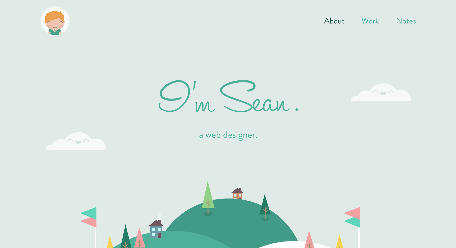
http://seanhalpin.io
Scrolling through his website gives me such peace. It’s simple. As a web designer, he understands. The typography and content convey his message, and the drawings infuse a personality that is welcoming, cute and lowkey.
A good website has a tagline. Sean Halpin’s is refreshingly short and tells me that he is an expert at this stuff.
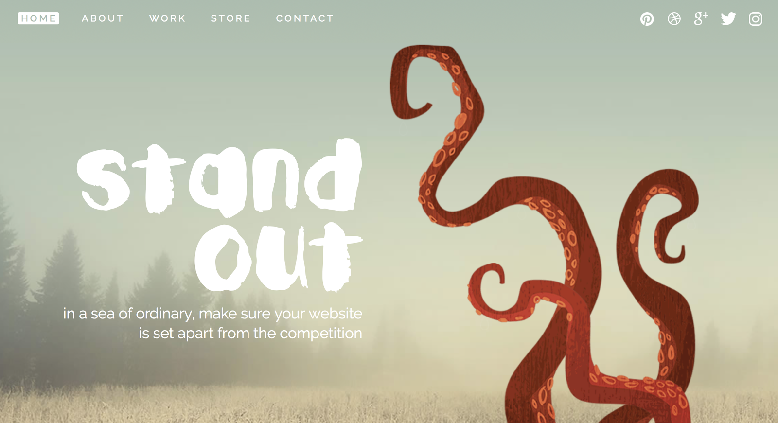
This is my favorite out of all of these examples. The website easy and the personality is to swoon for. Did I mention the ease? Denise Chandler has managed to a fit a lot of content on there, now that I am analyzing this, but it doesn’t feel like it! I just want to tell her, we are on the same wavelength.
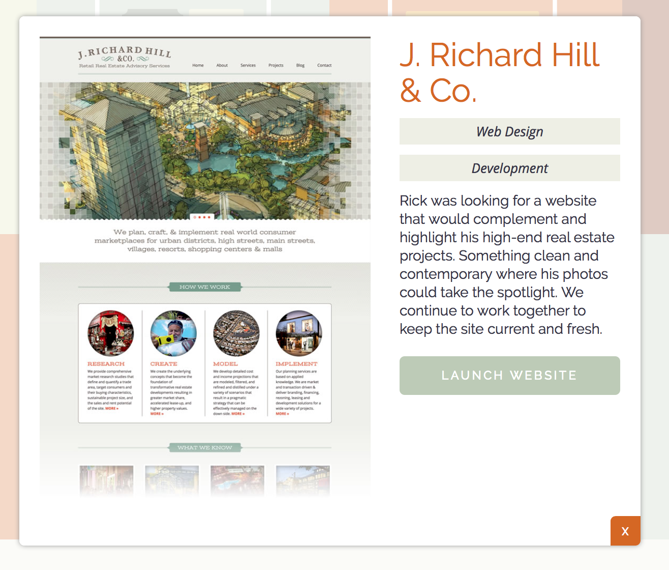
Do you see this dialog? It is beautiful! Do you see that close button? That pretty white x on an orange button that is 2D, not exactly a rectangle, not exactly a circle, but inlayed into the bottom right corner of the dialog.

I love his use of white space. It gives me such peace.

Many websites list an email address and perhaps a hyperlink that opens up an email message. For me, the latter is not preferable because I don’t like using the default Mail app. Matt Farley’s contact method opens up a form where people can directly contact him. Forms bookend his page, a call to action.
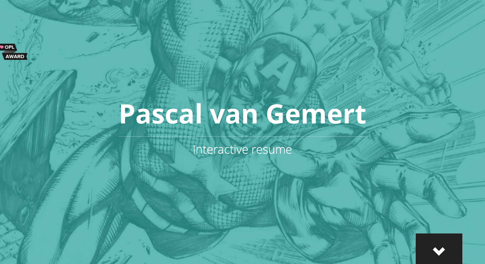
Yaaaaaaaaas. Pascal van Germert has his entire website/interactive resume in one page. The navigation is a vertical sidebar which reflects great spatial navigation (checkout Don Norman’s explanation on this). Also, I love how there are quotes dispersed throughout. I’m wondering, what is “.nl?” I haven’t heard of that URL before.

Neat. Really cool. A simple tagline can be found on the navigation bar, and then his home page dives into a nice list of his blog posts. I like how it’s clean and only shows the title and date. I mean, I get how revealing a bit of the text of the blog post can help direct traffic, but I like how this website lists out all the blog posts in an easy-to-scan manner.

Adorable! I’m squealing it’s so cute. Diana Chiu’s website reflects her passion for “building, in both virtual and real spaces. I love to create things, especially things that are super-extra-over-the-top-adorable, or at least make people happy.” Yes, yes, I am very happy.

I like how Cassidy William’s website reflects a software developer’s tools. The background is dark gray and the text is light gray with mustard yellow URLs. The font matches that of a nice looking monoic typography. The [+] text is clickable and reveals a detail.

Her change log is so cool. It mimics a version control list of changes, and it’s actually a list of updates in her life.
That wraps up the examples!
That wraps up the examples!
No comments:
Post a Comment